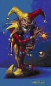
Yep. I need the static Gold U to be smaller and centered on a 150 X 150 space with a clear background.
I love many of the other things I saw done but I don't think I can change the house of Hermskii section. I'll have to look at that next after I fix this Gold U thingy!
Yeah. I'm all proud.
-
Hermskii
- Site Admin
- Posts: 8522
- Joined: Sun Jul 10, 2005 9:56 pm
- NoMoreSpam: Silver
- Location: Houston, Texas
- Contact:
Re: Yeah. I'm all proud.
~Peace~
Hermskii
Hermskii
-
*POTS*

- Posts: 2233
- Joined: Fri Oct 17, 2008 8:50 pm
Re: Yeah. I'm all proud.
Hook wrote: Yes - Now make the background Clear and you got it!
How...Hermskii wrote:with a clear background.
Hmm can't do it better than this, sorry I suck at photoediting.
You do not have the required permissions to view the files attached to this post.
Plain Old Telephone Service
-
gopostal
- Posts: 1396
- Joined: Tue Nov 18, 2008 9:32 am
Re: Yeah. I'm all proud.
This is a rip and composite of the U you see in the game menu. It's not as "meaty" as some you'll find around the net, but this one is the true U.
You do not have the required permissions to view the files attached to this post.
-
Hook

- Posts: 3444
- Joined: Fri Feb 16, 2007 9:41 am
- NoMoreSpam: Silver
- Location: Minnesota USA (Just West of MPLS - by a pond beneath a tree - Dead & Buried)
- Contact:
Re: Yeah. I'm all proud.
I am at work right now and I don't have the editor I use at home. (old age makes me forget LOL)*POTS* wrote:Hook wrote: Yes - Now make the background Clear and you got it!How...Hermskii wrote:with a clear background.
Hmm can't do it better than this, sorry I suck at photoediting.
It is a Photo Editor that comes with MS Office I believe called PhotoEd I am pretty sure, but most photo editors do it the same easy way.
Load up a Good U symbol with the Black background - it should be in a file type that supports clear (invisible - see through) backgrounds or layers such as gif or png. (gif works well)
Resize the image to fit within the 150 by 150 area if it isn't already.
Select the Black Background color and there should be a tool in the menu somewhere that says something like "Make Color Invisible or see through" (I can't remember the words Arrg! old age)
And is usually has a range slide bar are something that asks what percent either way of that exact color should it change.
Try 0% first and see how it looks then 1% if 0% has too many "ragged" edges.
The higher the percent, the more shades either side of black become "clear".
Last edited by Hook on Thu Apr 15, 2010 9:34 am, edited 1 time in total.
=Hook= of Hook's UT Place - Hopelessly Addicted to UT99!
Forum: https://hooksutplace.freeforums.net
CROSSBONES Missile Madness {CMM} (GT Top 50)
PRO-Redeemer | PRO-SNIPER-Redeemer | SEEKER-Redeemer
Birth Place of ALL Seeker/Scoped Deemers!
IP: NEW IP to come!
CROSSBONES Monster Hunt {CMH} (Special Edition MH by mars007)
IP: 108.61.238.93:7777
Forum: https://hooksutplace.freeforums.net
CROSSBONES Missile Madness {CMM} (GT Top 50)
PRO-Redeemer | PRO-SNIPER-Redeemer | SEEKER-Redeemer
Birth Place of ALL Seeker/Scoped Deemers!
IP: NEW IP to come!
CROSSBONES Monster Hunt {CMH} (Special Edition MH by mars007)
IP: 108.61.238.93:7777
-
gopostal
- Posts: 1396
- Joined: Tue Nov 18, 2008 9:32 am
Re: Yeah. I'm all proud.
That png I posted last was 150 square and the source is alpha channel. Herm if you rename that to sitelogo_ or whatever the logo file name is and overwrite, that will set you up.
And for you perfectionists: Yes I am well aware the image is a pixel off-center, low and to the right. I've used Black Pearl (this theme) and offsetting the logo just slightly makes it center when he applies it.
So there
And for you perfectionists: Yes I am well aware the image is a pixel off-center, low and to the right. I've used Black Pearl (this theme) and offsetting the logo just slightly makes it center when he applies it.
So there
-
*POTS*
- Posts: 2233
- Joined: Fri Oct 17, 2008 8:50 pm
Re: Yeah. I'm all proud.
1 - MS-Paint does not support PNG with Alpha Channel (translucent background)
2 - GIF is a lossy format
3 - Photoshop is as intuitive as a book written in double Dutch by a Babylonian priest
4 - MS PhotoEditor can set a translucent BG to a PNG image (nice one Hook) but can't smooth the edges
5 - I'd suggest using gopo's image anyway
2 - GIF is a lossy format
3 - Photoshop is as intuitive as a book written in double Dutch by a Babylonian priest
4 - MS PhotoEditor can set a translucent BG to a PNG image (nice one Hook) but can't smooth the edges
5 - I'd suggest using gopo's image anyway
You do not have the required permissions to view the files attached to this post.
Plain Old Telephone Service
-
Hook
- Posts: 3444
- Joined: Fri Feb 16, 2007 9:41 am
- NoMoreSpam: Silver
- Location: Minnesota USA (Just West of MPLS - by a pond beneath a tree - Dead & Buried)
- Contact:
Re: Yeah. I'm all proud.
On "4" - did you try using a higher percent dither of the background?*POTS* wrote:1 - MS-Paint does not support PNG with Alpha Channel (translucent background)
2 - GIF is a lossy format
3 - Photoshop is as intuitive as a book written in double Dutch by a Babylonian priest
4 - MS PhotoEditor can set a translucent BG to a PNG image (nice one Hook) but can't smooth the edges
5 - I'd suggest using gopo's image anyway
That usually takes away those "ragged" edges.
5 - Yes, Gopo's looks pretty good - maybe just "rich up" the color a tad.
=Hook= of Hook's UT Place - Hopelessly Addicted to UT99!
Forum: https://hooksutplace.freeforums.net
CROSSBONES Missile Madness {CMM} (GT Top 50)
PRO-Redeemer | PRO-SNIPER-Redeemer | SEEKER-Redeemer
Birth Place of ALL Seeker/Scoped Deemers!
IP: NEW IP to come!
CROSSBONES Monster Hunt {CMH} (Special Edition MH by mars007)
IP: 108.61.238.93:7777
Forum: https://hooksutplace.freeforums.net
CROSSBONES Missile Madness {CMM} (GT Top 50)
PRO-Redeemer | PRO-SNIPER-Redeemer | SEEKER-Redeemer
Birth Place of ALL Seeker/Scoped Deemers!
IP: NEW IP to come!
CROSSBONES Monster Hunt {CMH} (Special Edition MH by mars007)
IP: 108.61.238.93:7777
-
gopostal
- Posts: 1396
- Joined: Tue Nov 18, 2008 9:32 am
Re: Yeah. I'm all proud.
I started to do some of that, make it more vibrant, but I know Herm is a something of a purist. The U that I posted is a perfect replica of the in-game U from the loading screen. If you look in ed there are actually 4 large tiles that comprise this image. I stitched them together, then resized down to appropriate dimensions (with the slight offset).
A lot of times on those ragged edges, you just have no choice but to blow up to 600% and manually smooth the edge. Depending on the source (especially jpg which is lossy as heck) you might have to really work to get it to look nice. The eye really notices it though, so don't skimp on doing it right.
For a place to see really good work search for Fark. You'll find some simply awesome guys on there that can do things you never knew you never knew (though I am NOT telling you which account is me).
A lot of times on those ragged edges, you just have no choice but to blow up to 600% and manually smooth the edge. Depending on the source (especially jpg which is lossy as heck) you might have to really work to get it to look nice. The eye really notices it though, so don't skimp on doing it right.
For a place to see really good work search for Fark. You'll find some simply awesome guys on there that can do things you never knew you never knew (though I am NOT telling you which account is me
-
Hermskii
- Site Admin
- Posts: 8522
- Joined: Sun Jul 10, 2005 9:56 pm
- NoMoreSpam: Silver
- Location: Houston, Texas
- Contact:
Re: Yeah. I'm all proud.
Wow! When I looked at GOPO's in MS Paint it looked like crap but since everybody said it would only look right in certain programs under certain settings and all of that, I decided to give it a shot. I think it came out pretty good and the background is perfect. It seems to sit a little low for me but better is better right! It is really all I aim for... to get better and better.
~Peace~
Hermskii
Hermskii
-
MEAT
- Posts: 2525
- Joined: Sat Oct 01, 2005 5:17 pm
- Location: behind you
- Contact:
Re: Yeah. I'm all proud.
2 idea's for your veiwing:

____________________________________________________________

____________________________________________________________
-
Hermskii
- Site Admin
- Posts: 8522
- Joined: Sun Jul 10, 2005 9:56 pm
- NoMoreSpam: Silver
- Location: Houston, Texas
- Contact:
Re: Yeah. I'm all proud.
Lets call that top section a frame for my sake. I could see and know exactly what the bird section was an the size of it so I knew how to change it. I would love to change the whole top section if I could but I can't find what the files are called that it currently uses so I don't know what to change there. If I could change out the whole top few inches of this I'd be real excited and motivated to do it. I'm sure it may be easy but nothing is easy when you don't have all of the facts or know-how. Peace!
~Peace~
Hermskii
Hermskii
-
Hook
- Posts: 3444
- Joined: Fri Feb 16, 2007 9:41 am
- NoMoreSpam: Silver
- Location: Minnesota USA (Just West of MPLS - by a pond beneath a tree - Dead & Buried)
- Contact:
Re: Yeah. I'm all proud.
MEAT, the problem with your very nice banners is that they will not fit in this forum skin.
(EDIT: See What Gopo Posted Below! - I too have used this very theme - you are able to alter the logo width a bit but it distorts things.
Look at my forum - I use a different sized logo than it came with also but it made the forum a bit wider)
The Text copy is not part of the logo picture on this skin so including it in the banner picture wouldn't work.
You can vary the width of the logo pic. a bit - if wider, the text part gets squished up - the wider the logo is, the more squished the text part.
Did that come out clear? (I'm still not awake yet)
Herm, can't you get to that part in your Admin Control Panel (ACP)?
(EDIT: See What Gopo Posted Below! - I too have used this very theme - you are able to alter the logo width a bit but it distorts things.
Look at my forum - I use a different sized logo than it came with also but it made the forum a bit wider)
The Text copy is not part of the logo picture on this skin so including it in the banner picture wouldn't work.
You can vary the width of the logo pic. a bit - if wider, the text part gets squished up - the wider the logo is, the more squished the text part.
Did that come out clear?
Herm, can't you get to that part in your Admin Control Panel (ACP)?
Last edited by Hook on Fri Apr 23, 2010 8:41 am, edited 1 time in total.
=Hook= of Hook's UT Place - Hopelessly Addicted to UT99!
Forum: https://hooksutplace.freeforums.net
CROSSBONES Missile Madness {CMM} (GT Top 50)
PRO-Redeemer | PRO-SNIPER-Redeemer | SEEKER-Redeemer
Birth Place of ALL Seeker/Scoped Deemers!
IP: NEW IP to come!
CROSSBONES Monster Hunt {CMH} (Special Edition MH by mars007)
IP: 108.61.238.93:7777
Forum: https://hooksutplace.freeforums.net
CROSSBONES Missile Madness {CMM} (GT Top 50)
PRO-Redeemer | PRO-SNIPER-Redeemer | SEEKER-Redeemer
Birth Place of ALL Seeker/Scoped Deemers!
IP: NEW IP to come!
CROSSBONES Monster Hunt {CMH} (Special Edition MH by mars007)
IP: 108.61.238.93:7777
-
gopostal
- Posts: 1396
- Joined: Tue Nov 18, 2008 9:32 am
Re: Yeah. I'm all proud.
I've used this particular forum theme before and the way you guys want to edit it won't work. The top frame uses a spacer that is very thin and duplicates it sideways to perfectly fit any resolution. If you want to add a banner you are going to have to actually go into the php coding of the theme and add it. The bird logo and the text are all added over top of the background frame that is duplicated so it's not as simple as tacking a jpg on. Really you are somewhat stuck with replacing the stock icons and textures with those of the same size. Sorry guys, I wish I had better things to say about it. I love the theme, but phpBB is really hard to alter unless you know php coding.
-
MEAT
- Posts: 2525
- Joined: Sat Oct 01, 2005 5:17 pm
- Location: behind you
- Contact:
Re: Yeah. I'm all proud.
Not trying to cure cancer just throwing out some visual ideas.
Ideas that are somewhat easy to do if all Hermskii has to do is layer textures.
And from looking at his current attempt he is halfway there.
Just beef up the middle text and add another logo and it's the same as mine.
Not that mine is the way to go but the forum home page could use some sex appeal...

-
Fuzz_Ball
- Posts: 822
- Joined: Thu Nov 13, 2008 5:18 pm
- NoMoreSpam: Silver
- Location: PHX, AZ
- Contact:
Re: Yeah. I'm all proud.
Yeah what he said.MEAT wrote: Just beef up the middle text and ...... the forum home page could use some sex appeal...
SWEET MOTHER OF GOD, GIVE THE BOY SOME FONTS!!!!!!

_  * *
* * 
* *